


Counterpose
/I am forever inspired by friends spaces. I was looking through Sarah’s feed and the thought occurred to me - since we have opposite color stories wouldn’t it be fun to compare them.
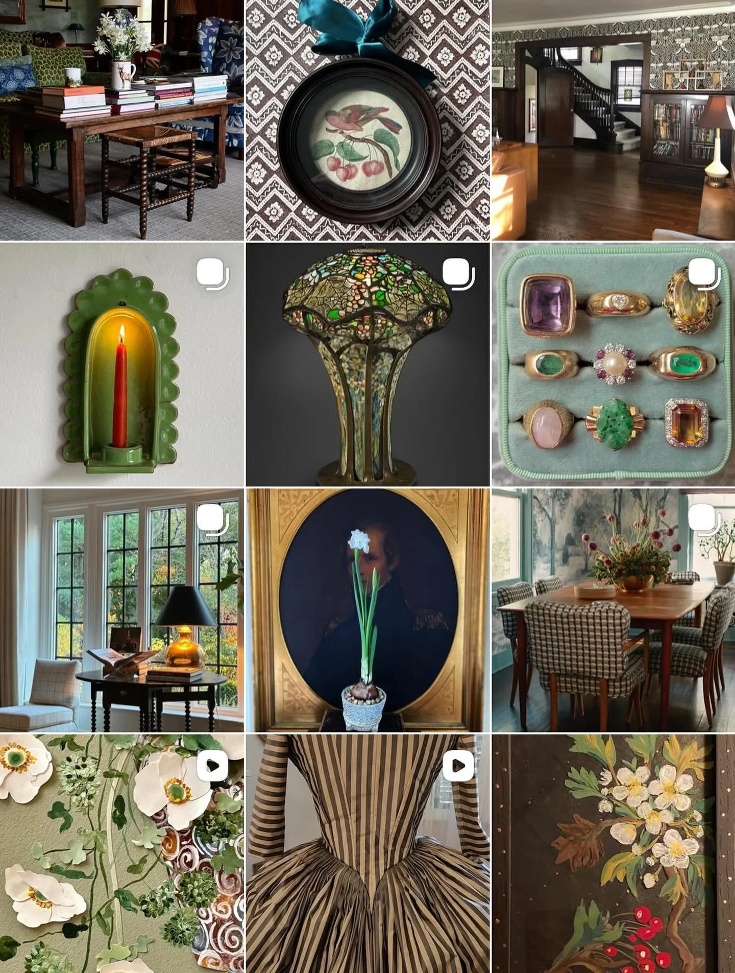
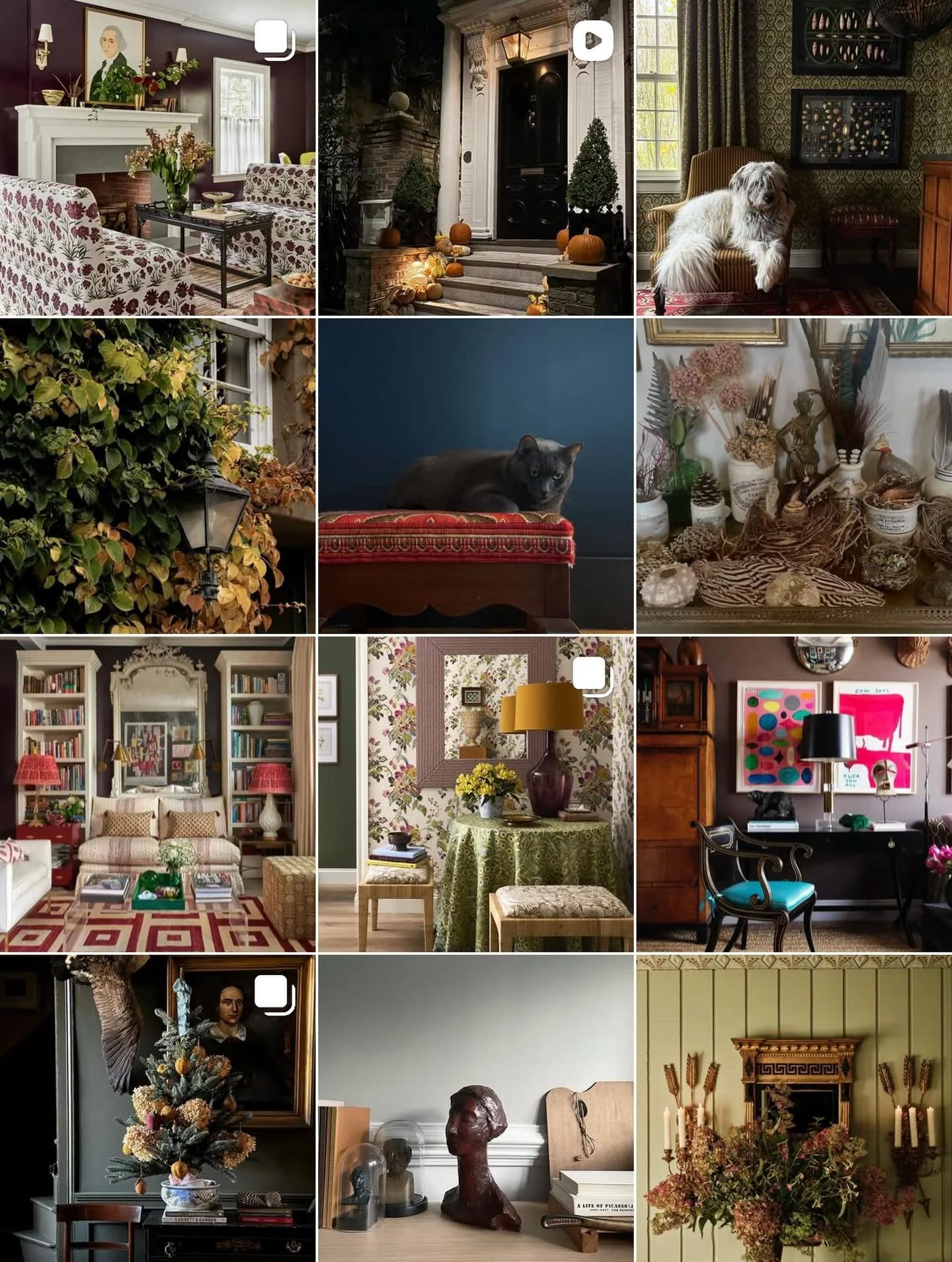
Let’s take a look at the elements that make up these spaces.

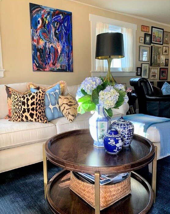
Sarah’s livingroom
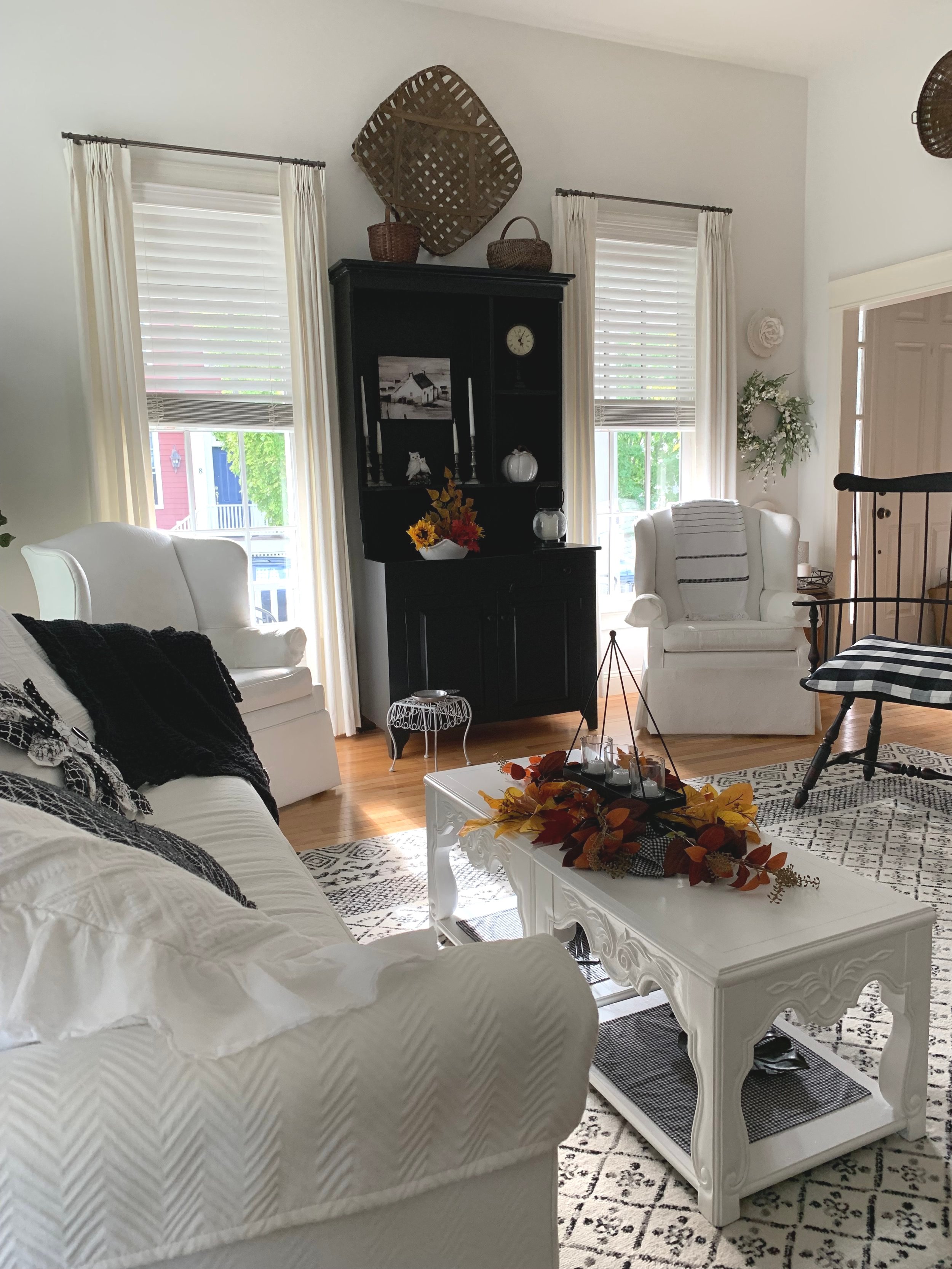
Let’s review Sarah’s livingroom.
The sofa is the beautiful Cara by Mitchell Gold+Bob Williams in Aegean velvet. Sarah further customized the piece with nail-head detailing.
The pillows are a mix of high low. The Velvet Round is by Lulu and Georgia. The Floral Block Print is Studio McGee for Target.
The Coffee Table is RH.
The side table is similar to this Target style.
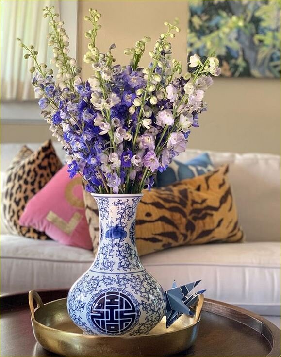
The Nerida White Footed Centerpiece Bowl is filled with flowers.
Her rug is a similar to this Overstock rug.
The room has a neutral background: Benjamin Moore Wickham Gray

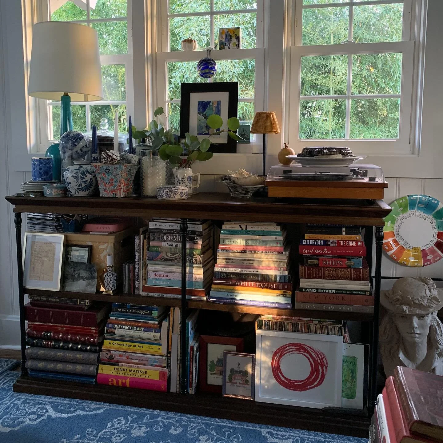
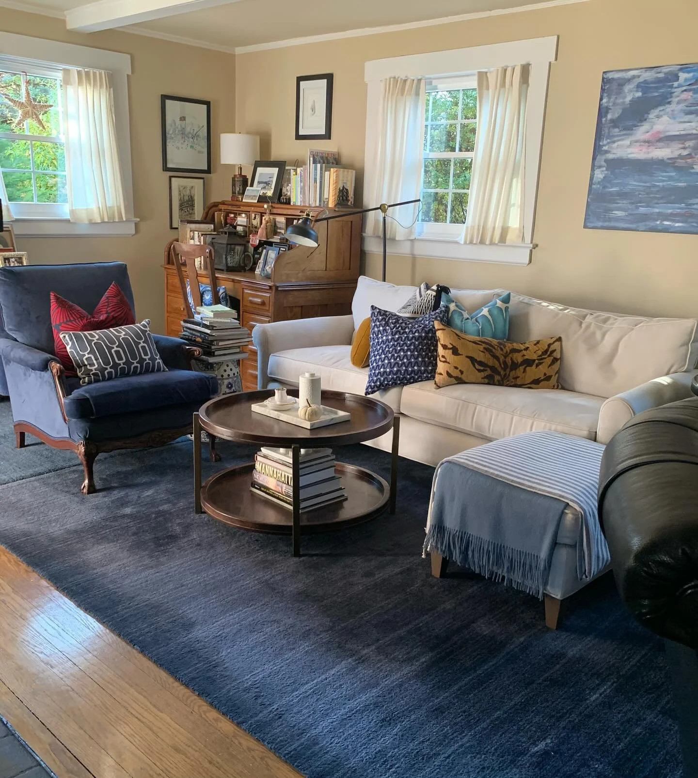
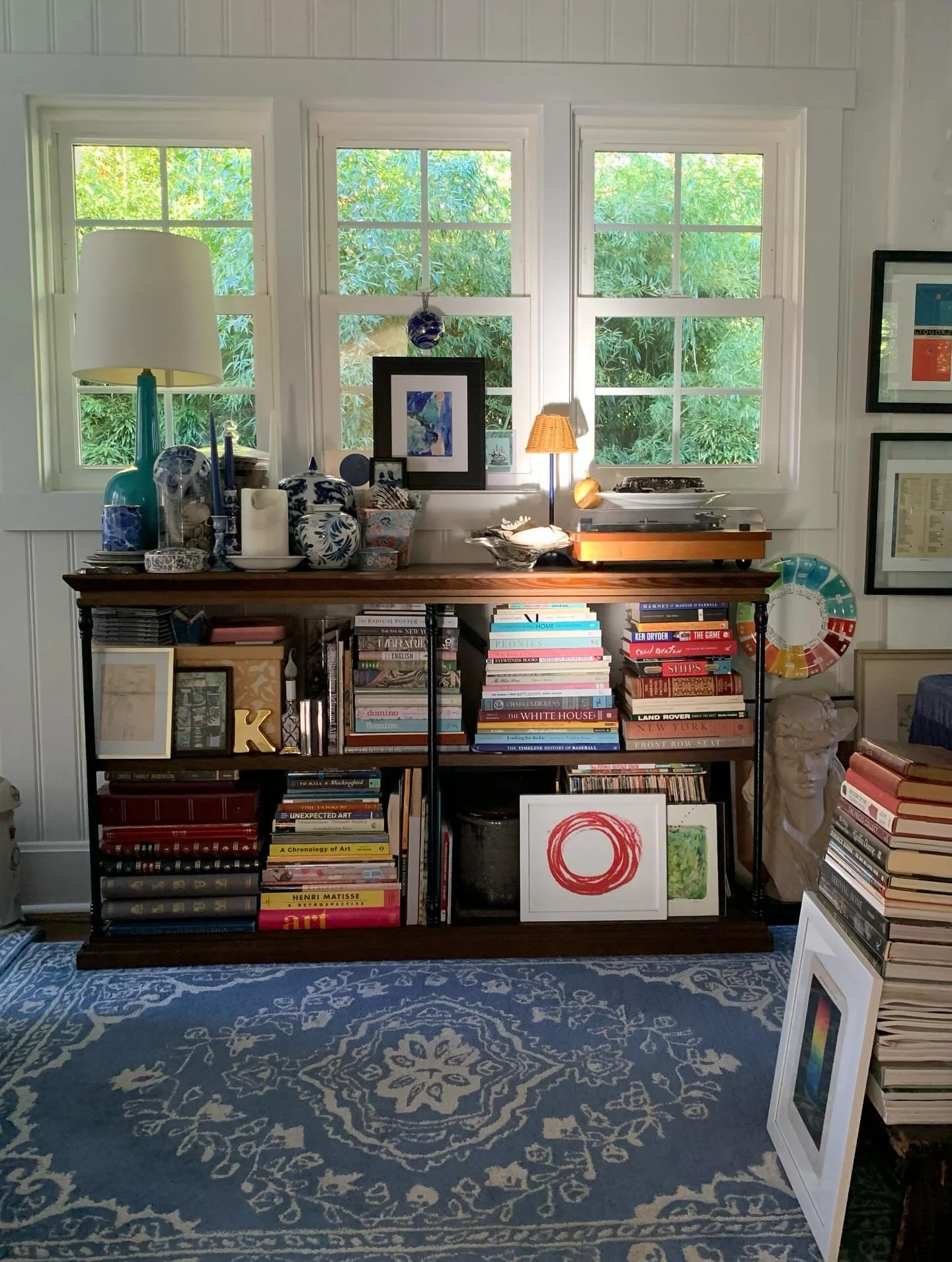
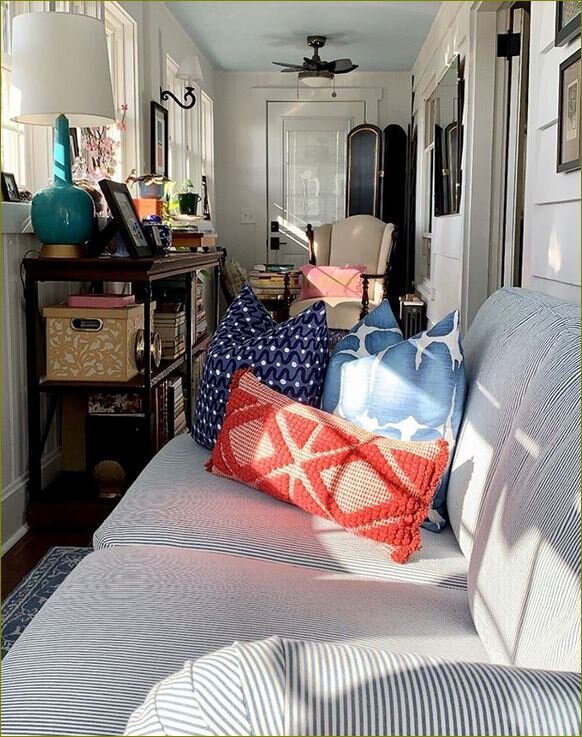
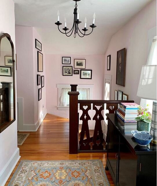
The Chalet Livingroom
Let’s review the Chalet livingroom.
Our sofa is the Montclair by Crate&Barrel which is discontinued. Purchased in the fall of 2018. The sofa was quickly replaced because of a snafu with the fabric which I was unable to have treated for stain resistance; so we opted for a high performance micro-fiber in Arctic White.
My pillows are a mix of store bought and ones I’ve designed. The small needlepoint is Beekman 1802 from Target years ago. The Brown Floral and Light Blue Shibori I sewed myself. The Tiger velvet is from Home Sense. The Navy and White Woven is from Marshalls.
The Coffee Table was found at Home Sense.
The side table is similar to this Wayfair one.
White with blue floral design vase with flowers. This piece was a gift and Little Switzerland no longer carries vases. These are lovely options.
The rug is the Baxter Indigo Wool from Crate&Barrel.
The vintage lamp was thrifted from The Lafayette Mill Antiques Center.
The reversible cotton quilt was located on-line years ago. Here’s are some pretty options.
The room’s background is: Benjamin Moore Putnam Ivory
“Counterpose: To place in Opposition, Contrast, or Equilibrium”
I enjoyed crafting this piece - it was fun locating the components and seeking similar ones to share with you. I highly recommend popping over to Instagram and clicking follow on Sarah’s feed. She and her home are both lovely!
Here are some articles you may enjoy!
Couch - furniture for sitting or reclining 11.14.18
Design Shift 1.16.19
Chalet Design 6.12.19
Revisiting the Reimagined 2.24.21
Til next time be well friends.