


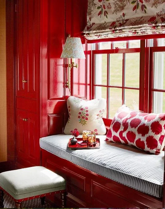
Seeing Red
/I recently saw an image of a red room that got my juices flowing… so I thought a-ha yes, I need to share a piece dedicated to this amazing hue! Let’s take a peek at Red in design.
RED: a color whose hue resembles that of blood or of the ruby or is that of the long-wave extreme of the visible spectrum. Merriam-Webster
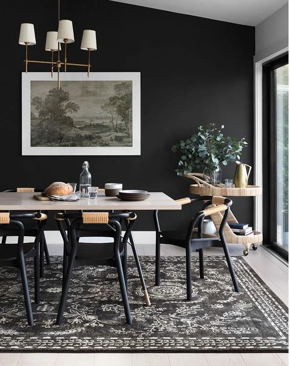
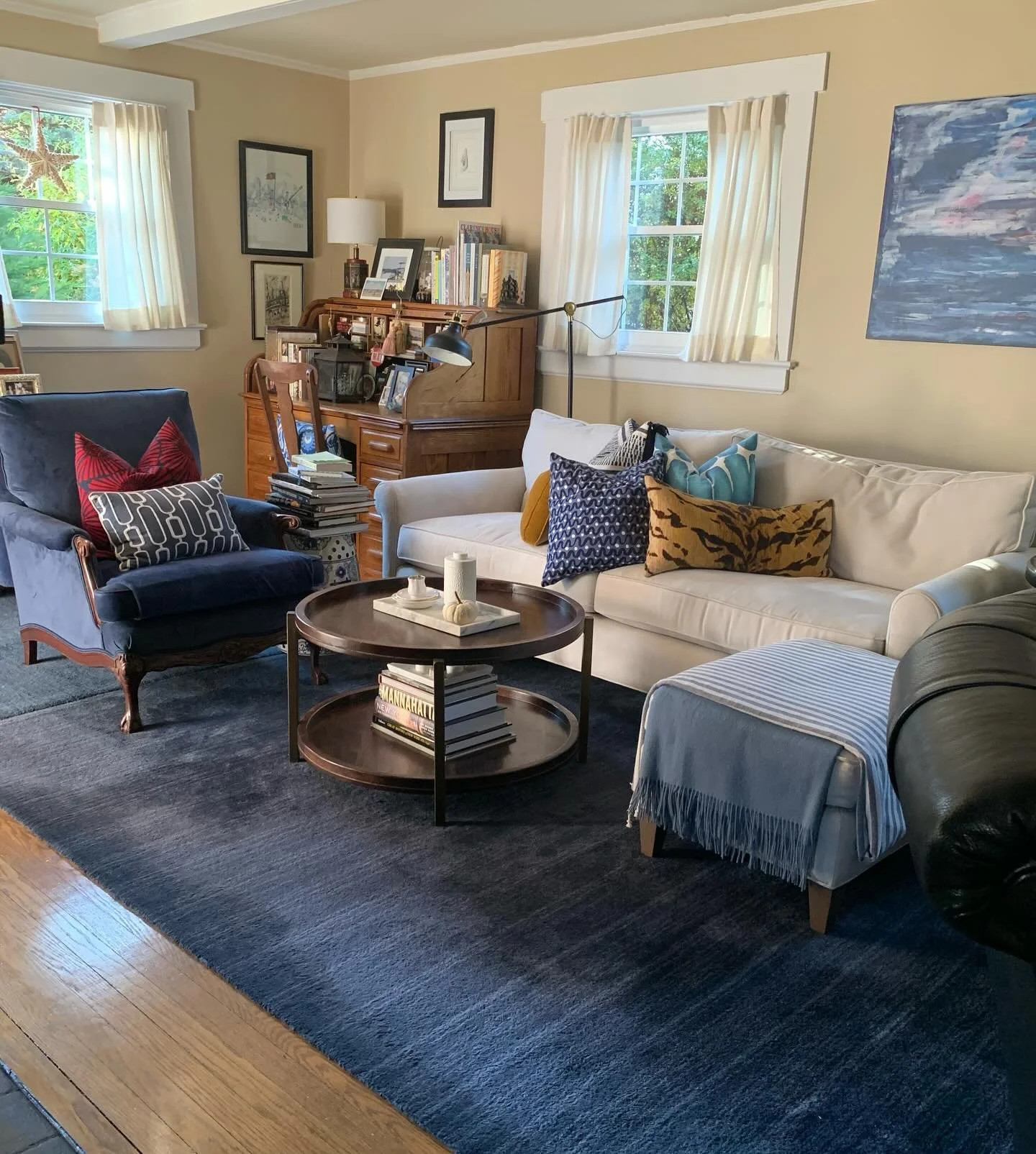
We all know what an incredible impact color has on our emotions. Red is the color of blood and fire. It is tied to love, passion as well as anger and danger. It never fails to pop when used in design.

Other words that represent the color red: blood red, brick, burgundy, crimson, cinnabar, fire engine red, flame, Indian red, maroon, rouge, rose, ruby, russet, rust, scarlet, tomato red, vermilion.

The color red is highly visible and grabs attention quickly; enabling the eye to focus. It’s the reason it’s associated with danger and why fire trucks, stop signs and flashing lights are red.

Red has different meanings in other cultures. In China red is used for good luck and represents happiness and prosperity. You are presented with a Red Envelope (filled with money) for special occasions.
In South Africa red is the color of mourning.

A Ruby gemstone is traditionally red and symbolizes courage, life force and passion.


Here are some phrases associated with red.
“red eye” is an overnight airline flight.
“red flag” something that attracts negative attention or cause for concern.
“red herring” is something that distracts attention from the main issue. A diversion.
“in the red” means loss of money.
to “paint the town red” means to celebrate.
“seeing red” means anger.
“red carpet treatment” to treat someone exceptionally well. a VIP.

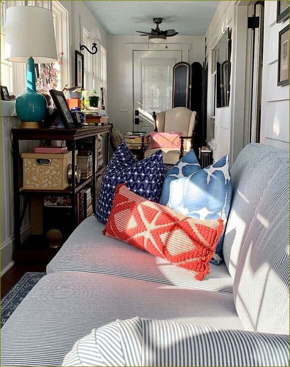
Do you use the color red in your decor? The next time you’re thinking about your space try adding a touch of this brilliant hue!
Til next time!