


Decorative Coating
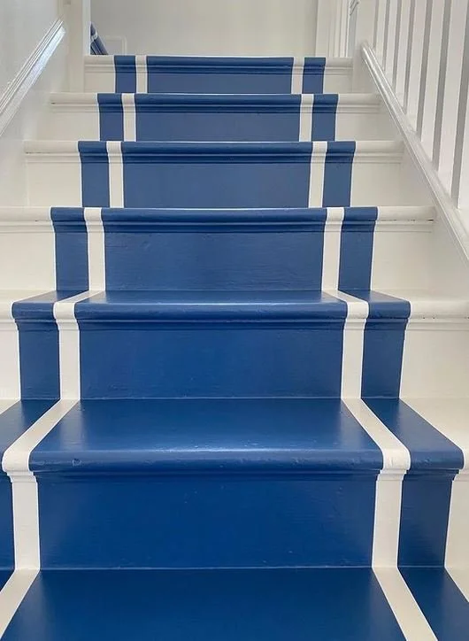
/Story ideas percolate from a variety of places. Sometimes a single image catches my eye. Weeks ago while on Instagram I saw an image Jennifer Acito shared in her Instagram stories and I was so moved by it. I quickly screen grabbed and reached out asking if I could share with my audience. Jennifer a fellow Jersey gal who is an accomplished Interior Designer graciously said Yes.
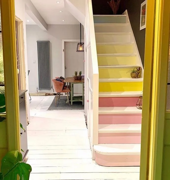
Look at this friends… the timeline of these beautiful stairs in her clients home. The final result is bold and awe-inspiring!
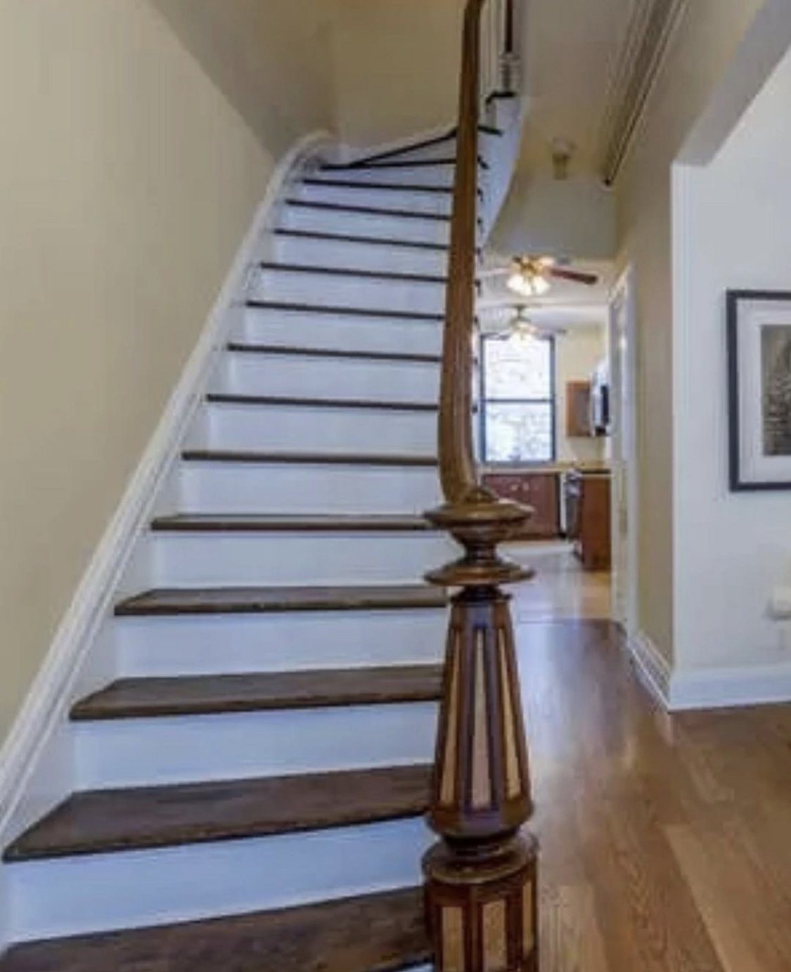
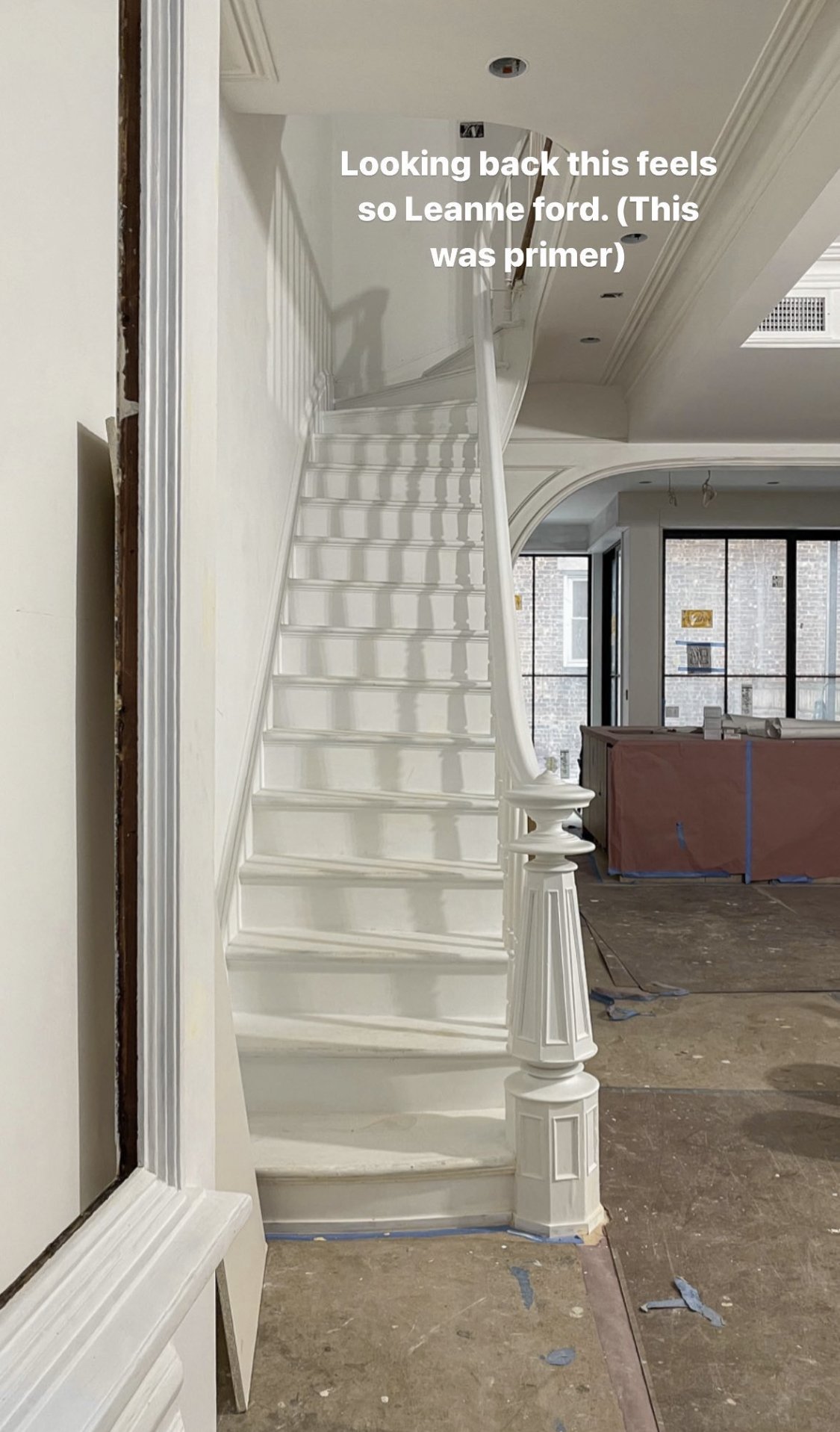

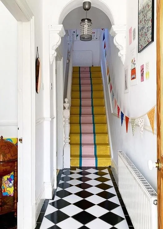
Oil-based paint should be used for long lasting results. Jen warned of the smell and shared when she redid the stairs in her own home she and her family moved out temporarily. This allowed the paint the proper time to cure. In her home and this client each stairwell was finished with a runner.
Jennifer loves to modernize vintage homes by adding paint and bold pattern.
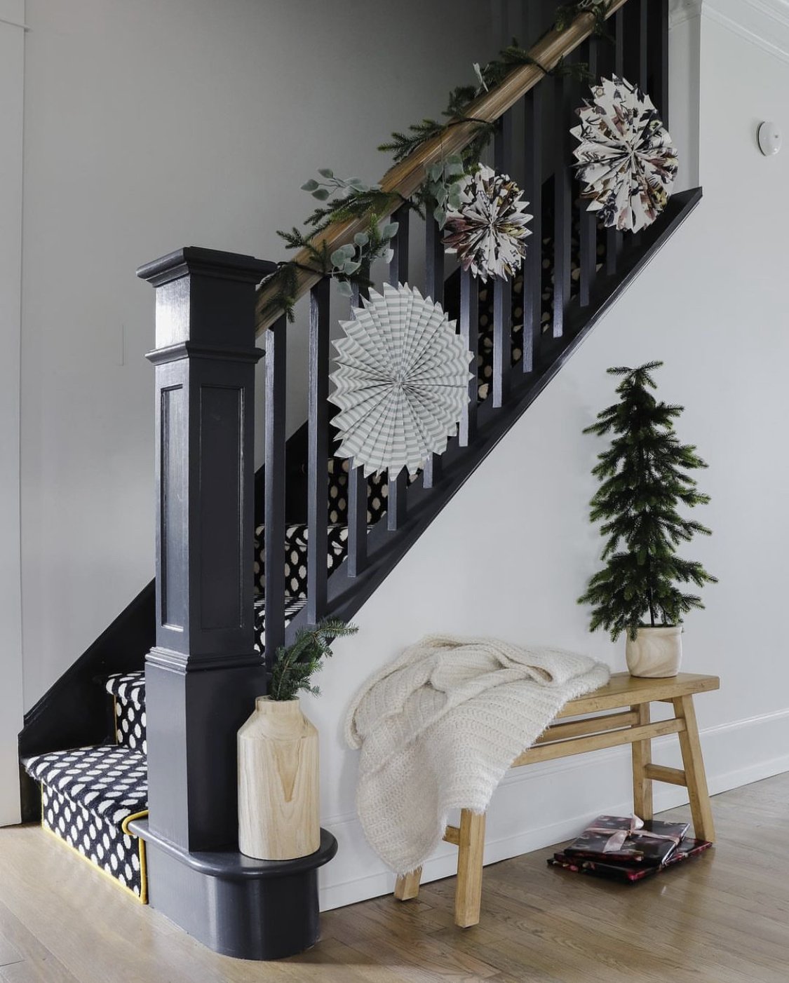
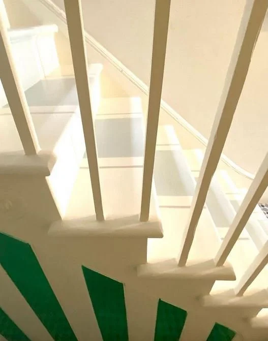
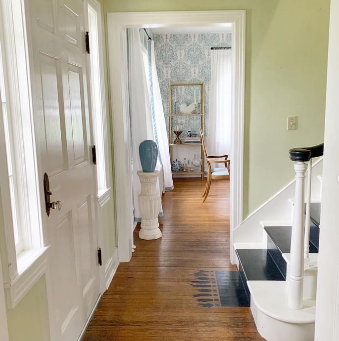
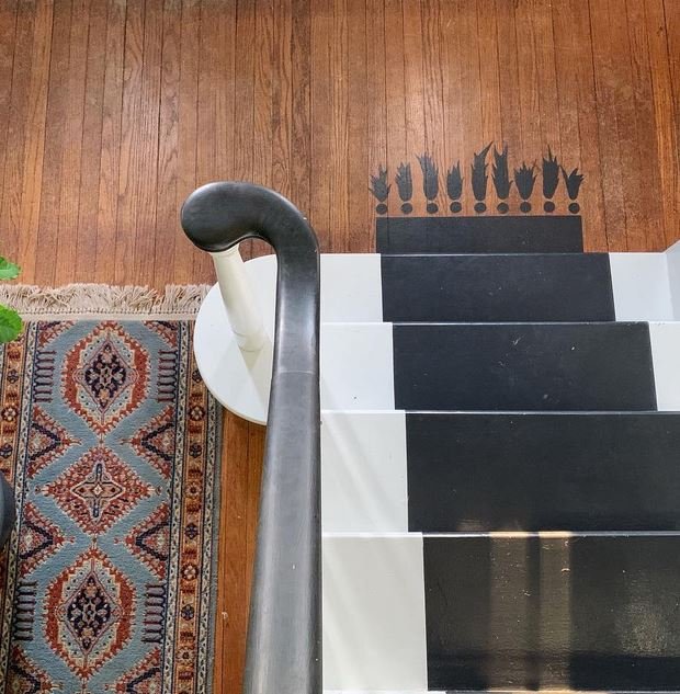
Another example of a dark stair with a cool runner from Katherine.
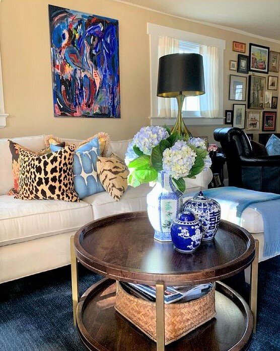
Katherine
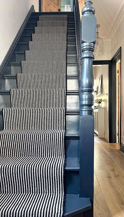
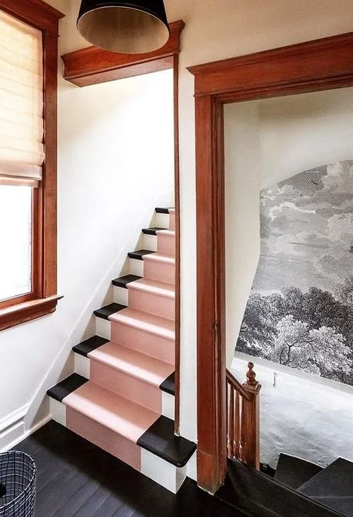
I’ve come across other brilliantly painted stairs.
Alice
Clara & Nick
Alice Peto

Collins Interior s
Nicole Balch
Kaitlin Smith
“PAINT: a colored substance which is spread over a surface and dries to leave a thin decorative or protective coating”

Holli
The Very Popular Farrow & Ball Off Black
The runner Jessica painted was extra with the fringe detail! I love it!
I hope you’ve enjoyed this dive into painted stairs. Maybe you’re motivated to tackle some in your own home!
Here in the Chalet we need to repaint the set leading to the basement. They were painted last in 2003 with marine-grade grey paint. Once we feel the shelving project and clear out is finished (years in the making) I plan on referencing these lovely stairs by Ruthie Jackson - they lead to her basement. We have beadboard on one side of the steps and I love the black treads.

Ruthie Jackson
Til next time be well friends! Please check out the accounts I’ve shared this week and give them some likes and a follow! See you over on Instagram!