KP Duty

Hi Friends after many months the kitchen refresh is finally complete!

All the Elements.jpg

Back in February I popped into Home Depot and came home with a sample of English Channel. I am not someone who needs a plethora of swatches. I knew I wanted a dark blue but, not navy and this color fills the bill perfectly.

Sample+English+Channel.jpg

On Friday July 24th we celebrated 17 years of ownership here at the Chalet. In that time all but two spaces have been redone at least once. (We like what we like and we like it for a long time! hahaha!) So the kitchen was one of the spaces that had not seen any updates since the original remodeling project in January 2005.

Original Kitchen 2005 .JPG

This is our kitchen in its full Ben Moore Pumpkin Spice glory…. I loved the color so much for so long - until I didn’t. I started talking about painting the kitchen a dark blue last fall. I saw some raised eyebrows and I get it - I really do - the space is about 9’ x 9’ and I’m being generous - the measurement from the frig to the diningroom is 6’ 6 inches.

If you follow along on IG than you never see this space. It’s small, hard to photograph and the light levels vary between barely any to being very bright thanks to it bouncing off our neighbors house.

Steven.jpg

In April I painted the trim - the problem was I didn’t have the wall and ceiling paint. This is my very sweet husband - he went to the store (during the the height of the pandemic here in New Jersey) and bought me paint. I started painting the ceiling Behr Paint Pink Prism in May but, as it is with life especially during Covid the project stalled. On July 22nd he took pity on me and gave the ceiling the second coat it needed and then my friends I was off to the races!

4D37A92D-6007-4D91-AA32-88EF9434C22F.JPG

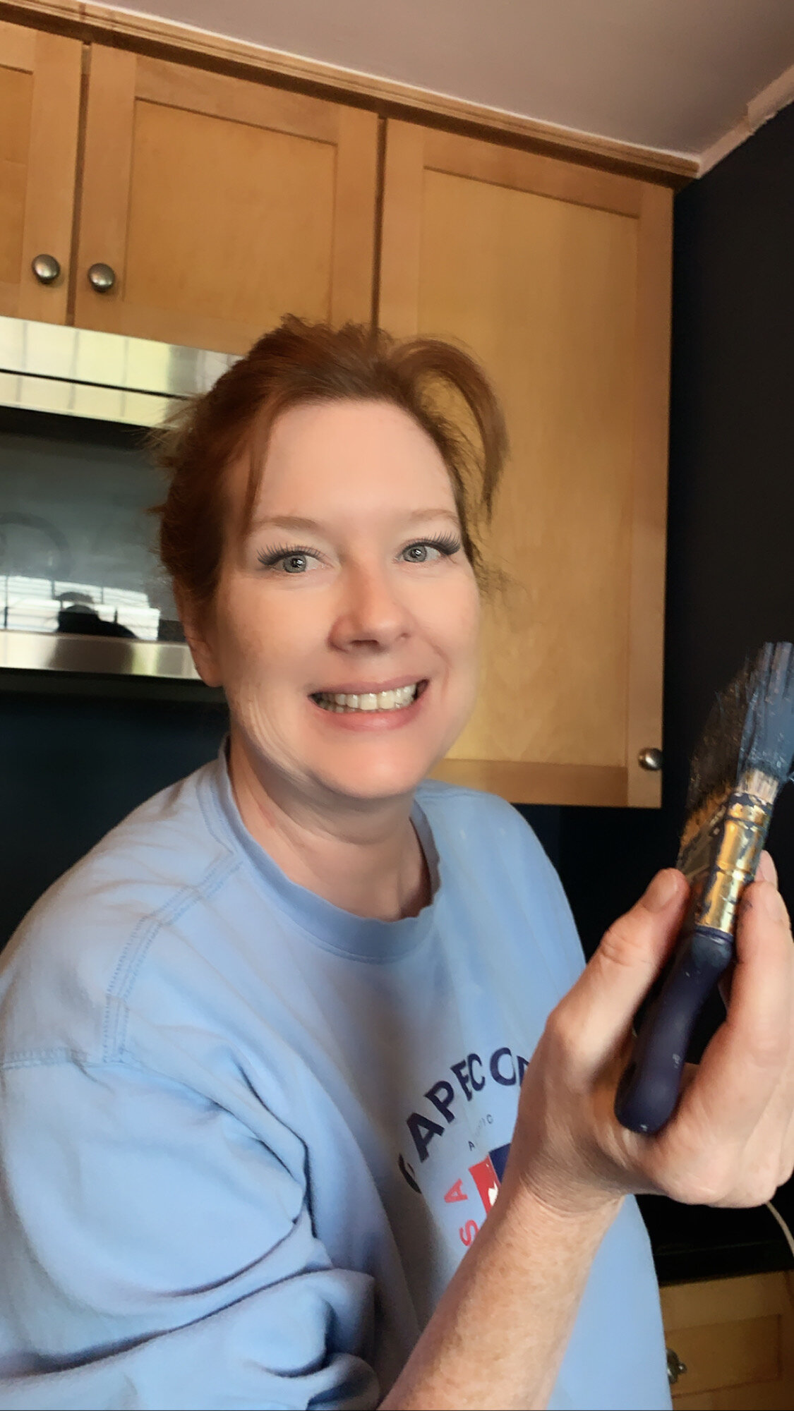
I painted for 6 hours on Friday July 24th (that magical 17th Houseaversary) and for another 8 hours the next day. I know you’re thinking what?1? 14 hours to paint such a small space but, I started brushing and stuck with it. I like brushes they offer me a control I don’t feel with a roller. I also used artists brushes to get in to some of the nooks and crannies.

IMG_2116.jpg

By Saturday night there was Art! Thanks so much Christina for lending your eye!

Stove++side.jpg
KP duty is “kitchen police” or “kitchen patrol”...
— Wikipedia
IMG_2133.jpg

This image proves the ceiling really is Pink!

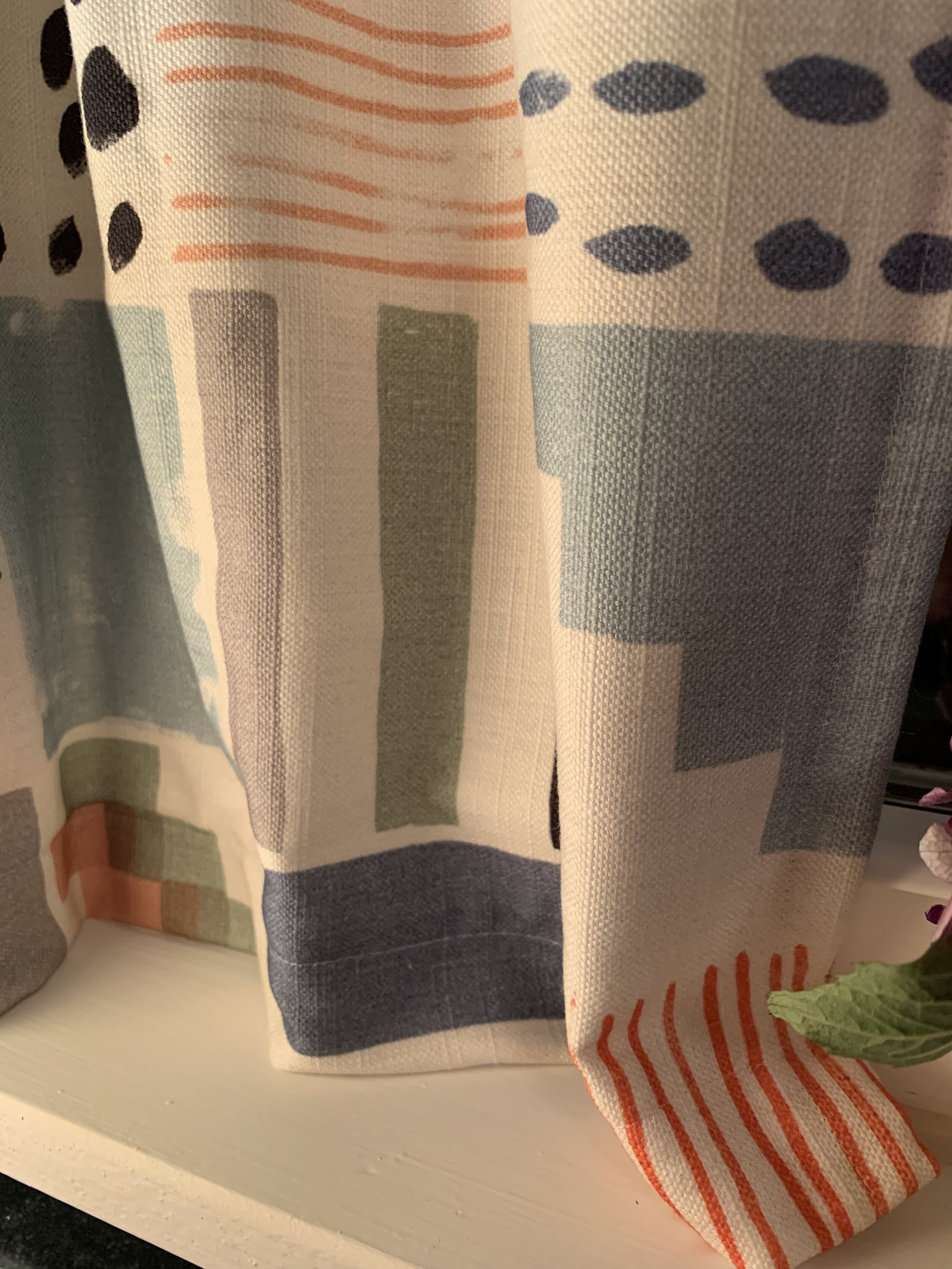
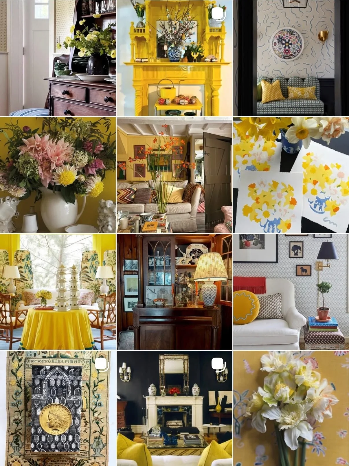
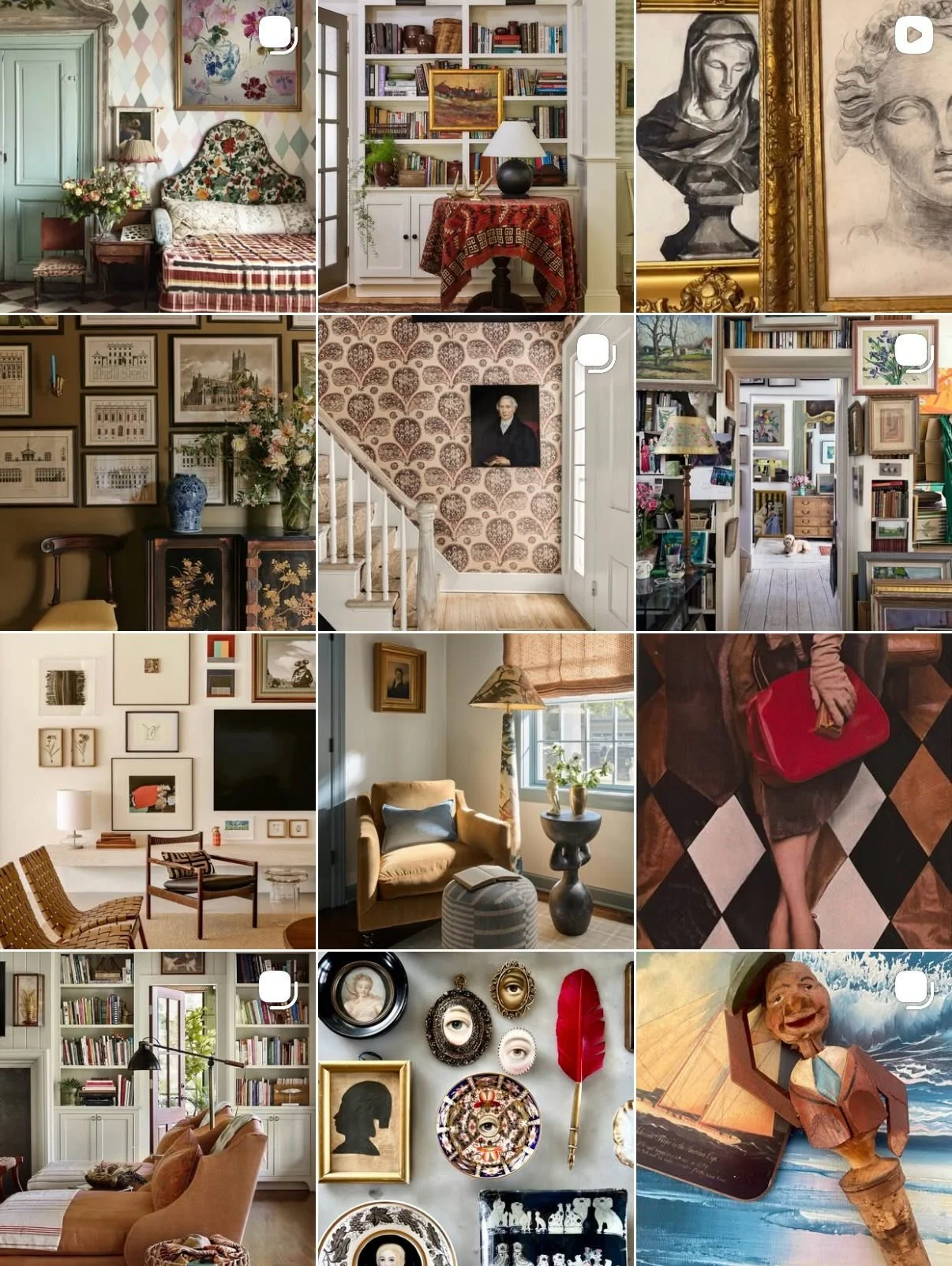
This fabric was the jumping off point for the rest of the elements in the space. Originally I thought about going in a chinoiserie direction but, when I closed my eyes and asked myself what did I want to live with? What did I see in my minds eye? Something I Ask Clients To Do… I saw fun with a modern twist and this fabric is the perfect blend of color and pattern to tell that story.

I first saw this fabric on my friend and Interior Designer Cameron Jones IG feed, she was sweet enough to grab a yard and mail it from Raleigh, North Carolina. It had been sitting in a bin in my basement for a few years - I am so glad I hadn’t used it for pillows or a client! So the last thing I tackled were the cafe curtains.

IMG_2184.jpg

I hope this has inspired you and let you see even professionals can struggle to get projects finished - for one reason or another.

This pretty space is getting a break while we’re at the beach - breathing in salt air, eating donuts, playing mini-golf - all while self distancing and wearing masks. Please know I’m here for assistance - email me - no project or query is too small!

Take care and Please wear your mask!

Gold Heart Meryl 2.png

Cool & Crisp

I love taking deep dives into color stories or design point of views. This week it’s all about White. I’m always drawn to white in design. It consistently looks lovely and fresh. White is a color associated with positivity - brilliance, cleanliness, faith, goodness, illumination, innocence, light, protection, purity, safety, spirituality, sterility and understanding.

Emily Henderson

Emily Henderson

Emily A. Schoen

Emily A. Schoen

Michelle Adams

Michelle Adams

Other words that represent the color white: alabaster, antique, cream, chalk, cornsilk, ghost, ivory, lily, linen, milk, old lace, paper, pearl, seashell, snow.

Ulrika

Ulrika

Apartment_34

Apartment_34

Dana Dore

Dana Dore

In most western cultures white is traditionally worn by brides to show purity. In many eastern cultures white is the color of mourning. Did you know the idea of a white picket fence offers a sense of safety?

Jennifer Maxcy

Jennifer Maxcy

Elizabeth

Elizabeth

Sarah Hart

Sarah Hart

Here are some phrases associated with the color white:

  • “white elephant” a rare unwanted item.

  • “white flag” to surrender.

  • “white knight” someone who comes to the rescue.

  • “white knuckle” something fast, exciting or frightening.

  • “white sale” a retail sale of sheets, towels and other linens.

  • “whitewash” to cover up or conceal.

Mandy Eno

Mandy Eno

Thanks so much for being here and subscribing - if you liked this post please let me know in the comments below. Til next time stay safe and wear a mask!

xo

Gold Heart Meryl 2.png

Images linked to all accounts.

Expressive Embellishments

Today I’m sharing some incredible spaces and designs - they are all different but, the common thread is they were all created using stencils and paint! Click images for source.

Alison Sheffield

Alison Sheffield

Being quarantined was just the focused time Alison Sheffield an interior designer from Cohassett, MA needed to tackle stenciling her entry hall. The results are fantastic! She has inspired many with the ongoing brilliant design of her home. Basically she never stops! And we are all the luckier for it!

Nicole Blackmon

Nicole Blackmon

Nicole Blackmon is constantly changing things up… and stenciling is only one thing she’s done on-top of temporary wallpaper, tile and floor decals. She stenciled this vintage family dresser and the results are fabulous. When she and her family moved into their latest NYC rental last summer she went to town - first she adding a graphic pattern to the kitchen and most recently she took to her fireplace surround.

Nicole Blackmon

Nicole Blackmon

Nicole Blackmon

Nicole Blackmon

Nicole shows marvelously that just because you rent - it doesn’t mean you can’t personalize a space.

Emily

Emily

Emily of Thirteen79 Design has also tackled walls and furniture. The walls above are from her bath - the chest of drawers below was inspired by an Antropologie bone inlay chest. Both designs are incredible!

Emily

Emily

Kim Jenkins

Kim Jenkins

I love this bold pattern Kim Jenkins added to her Livingroom walls - until I started researching this post I thought it was wallpaper! So cool! Kim’s whole home is full of cool design - her mix is effortless and leaves you swooning!

Kate Dreyer

Kate Dreyer

Kate Dreyer an interior designer outside of Washington D.C. added this great pop of pattern to her daughters bedroom - I love the fun feel - it’s a great backdrop to the rest of the colorful design.

Emma Carole Paradis

Emma Carole Paradis

Emma Carole Paradis is one half of Impeccable Nest design team from Bedford, N.H. In the midst of a few other projects around her home - she was inspired by our mutual friend Alison Sheffield to grab this amazing pagoda stencil and go for it in her principal bath. It really is stunning!


Here are the companies used (not in order of appearance): Cutting Edge Stencils, Royal Design Studio Stencils, Stencils Lab and The Stencil Library.


I have yet to use a stencil because we have original 1924 textured plaster in the Chalet but, maybe one day - maybe on a piece of furniture. Have you?

Thanks so much for subscribing and if you enjoyed my blog, please let me know by leaving a comment! Til next time I hope this finds you well.

xo

Gold Heart Meryl 2.png

Images linked to all accounts.