Aubergine in Abundance
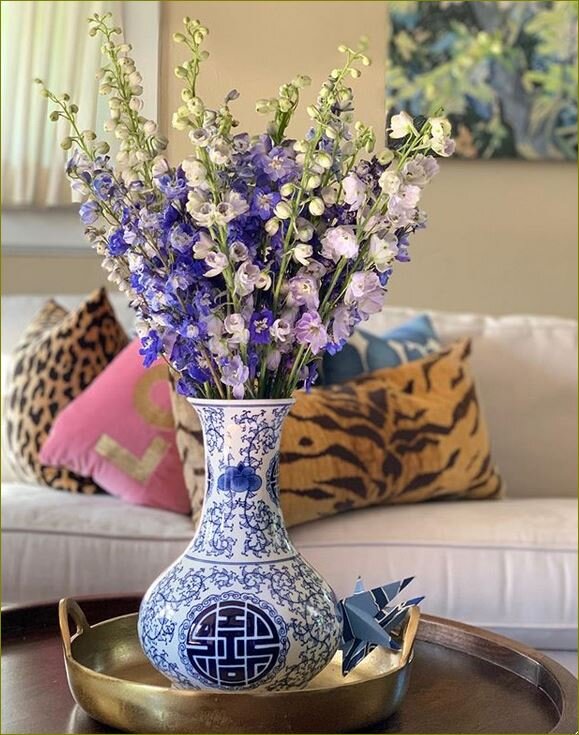
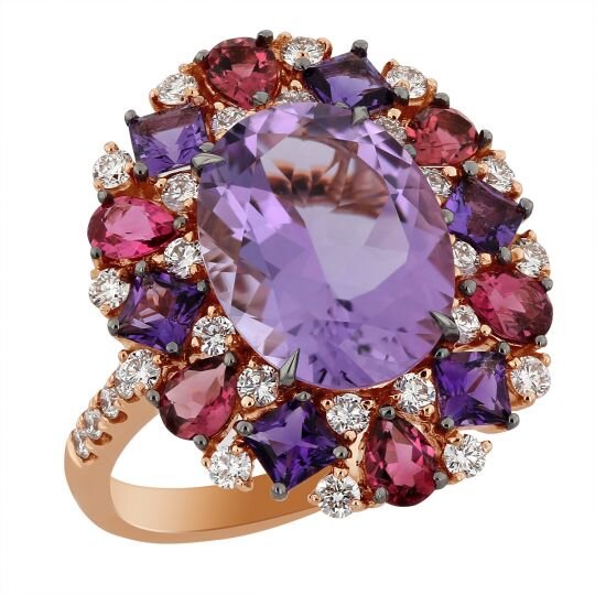
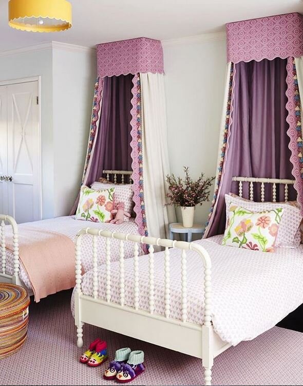
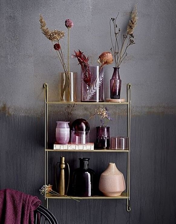
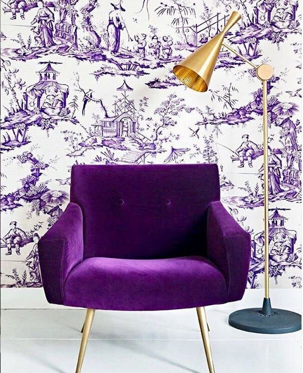
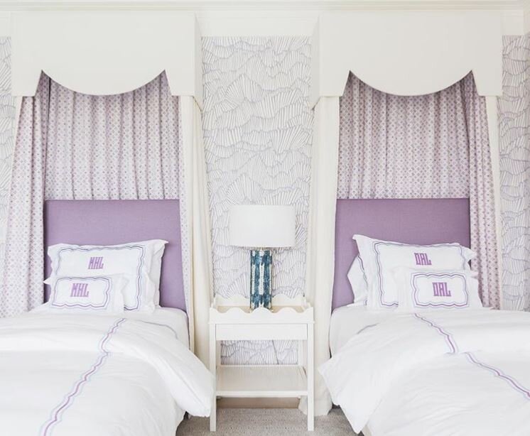
Lately this color in all it’s wonderful hues has been on my mind; maybe because I’m chomping at the bit for Spring - or maybe because its a favorite of my sister and my dear friend Amy who is celebrating her birthday today! Click image for source.

PURPLE: having a color between red and blue. Merriam-Webster

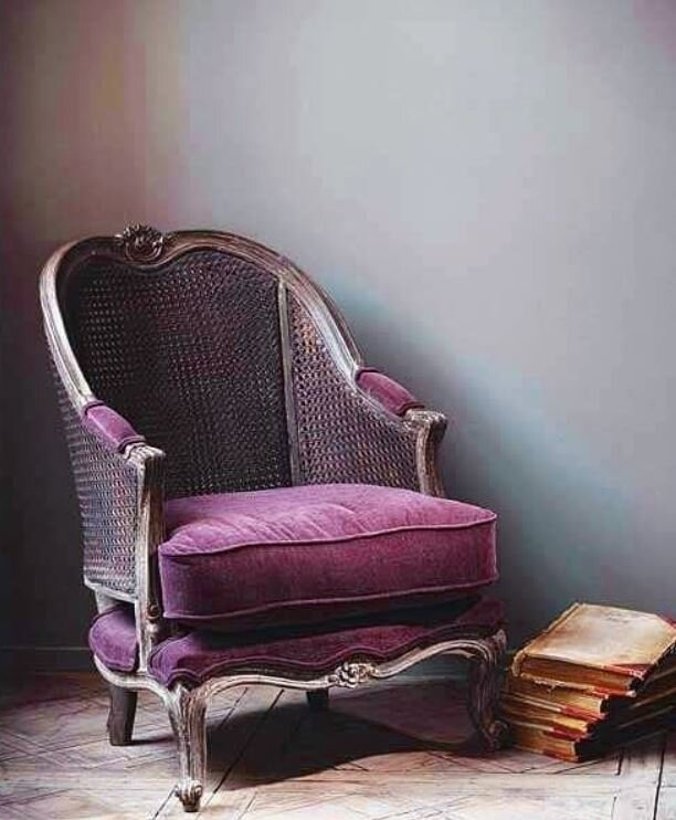
It is said that purple is a most lavish of all colors. It is the color of magic, power and theology. It is often associated with royalty, nobility, wealth and spirituality all over the world. Different hues have different meanings. Light purple represents femininity, romance and nostalgia. Bright purple suggest riches. Dark purple evokes gloom and sadness.

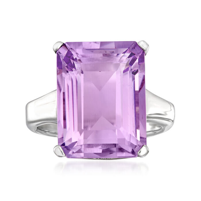
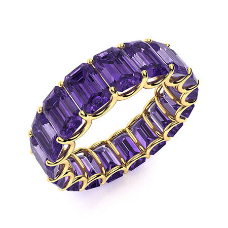
Other words that represent the color purple: aubergine, amethyst, eggplant, lavender, lilac, magenta, mauve, mulberry, orchid, plum, pomegranate, puce, royal, thistle, violet, wine.

Purple and Violet gemstones are said to calm, increase imagination, remove spiritual obstacles and re-energize learning.

Throughout history, purple were worn by royalty and people of authority. It was a designator of status. Because of the rarity of purple in nature it was expensive to create. In ancient Rome the color was created by boiling snails in lead vats and extracting the color to make Tyrian purple.

The United States Military awards the Purple Heart to soldiers wounded in battle.

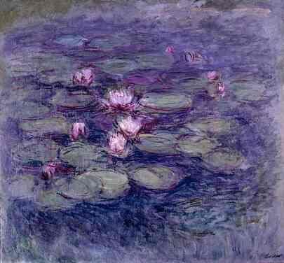
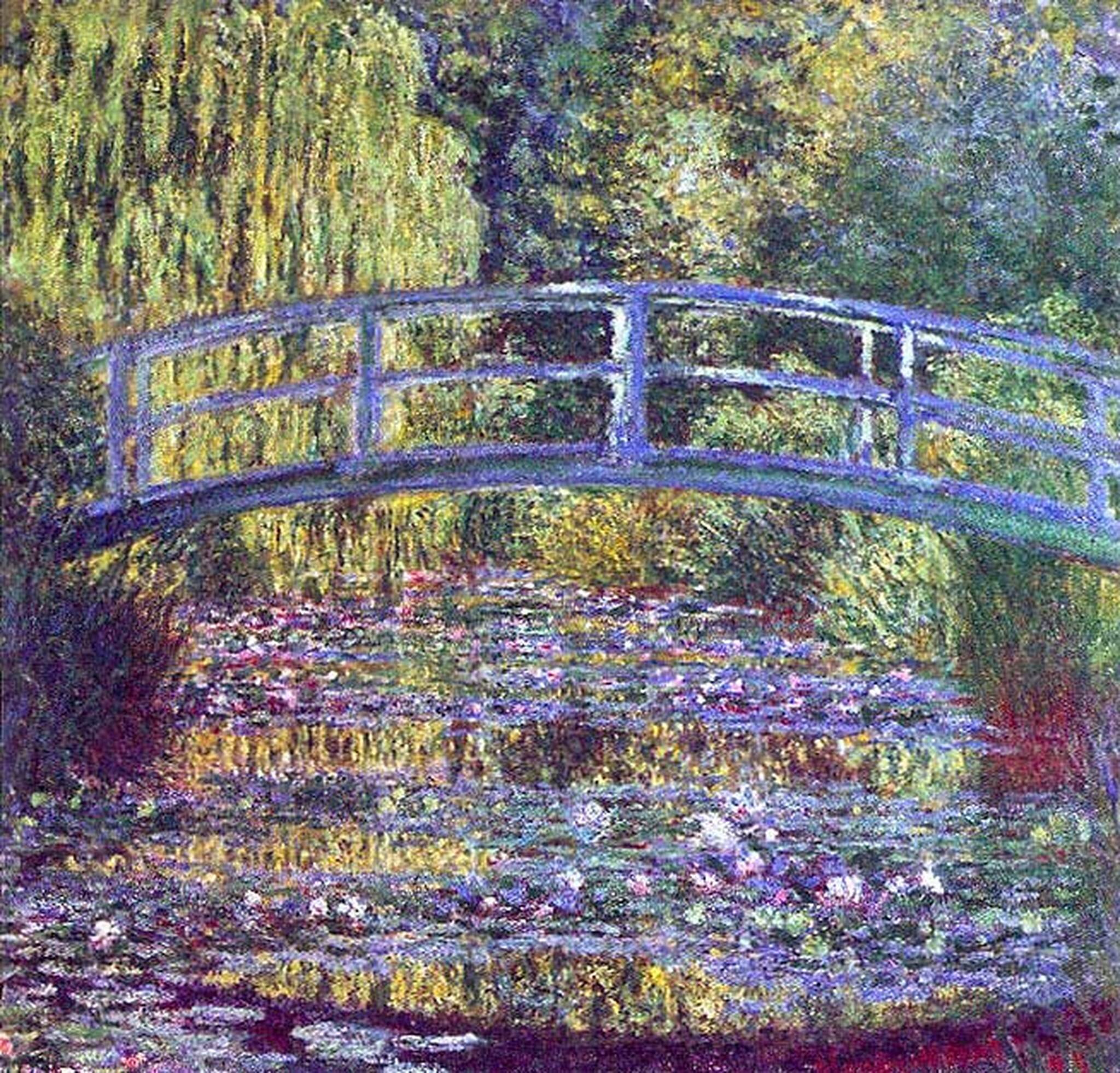
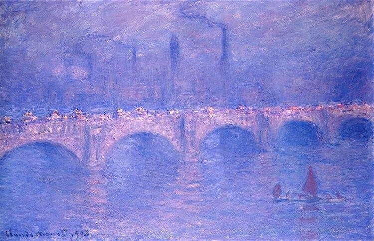
A few of Claude Monet's stunning works.

While the color purple represents royalty, lavender represents beauty and femininity.

Here are some phrases associated with purple.

  • “purple cow” something remarkable, unique, stand-out, eye-catching or unusual.

  • “purple haze” is euphoria which may be drug-induced

  • “purple prose” references large exaggerations, lies and highly imaginative writings.

  • “purple speech” is profanity or bad language.

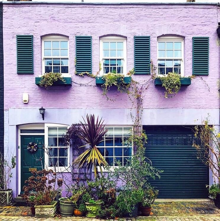
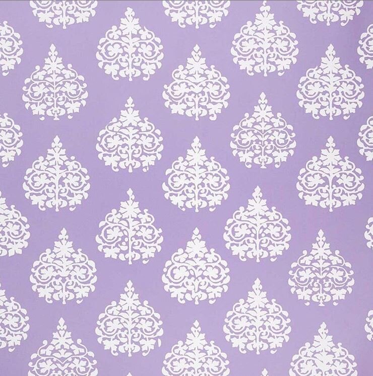
Do you decorate with purple or a variation of it?

Til next time!

Gold Heart Meryl 2.png

Stylish Situation

Everything we do in design is intended to make an impact.

I am so excited to share today’s piece. I had the most fun bringing some Chaletstyle to my dear friend Amy’s home. It’s a center hall colonial brilliantly decorated and filled with beautiful pieces and art. It has back to back living areas - and last fall we started chatting about freshening up the built-ins in both the Livingroom and the Television room. I was thrilled when I was asked for my help.

There were a total of 3 days spent styling, painting and restyling.

First let’s look at the Livingroom - this room overlooks the back garden.

Livingroom end of day 1

Livingroom end of day 1

Choices.jpg

On the first day we stared looking through all the design elements Amy has organized - I mean look at this friends - all ready to grab and go! And grab we did! Next we shopped the house a bit pulling pieces and some books from other rooms. Then the styling began!

I could shoot myself for not taking a true before image of the two spaces. I certainly didn’t have my blogging cap on that day in November.

Livingroom shelves

Livingroom shelves

Benjamin Moore: Kensington Blue 840

Benjamin Moore: Kensington Blue 840

After day one we admired both rooms - but, Amy wanted to go further. The conversation turned to Peel and Stick wallpaper in a grass cloth texture. After reviewing options and discussing an order was placed but, when it arrived it just wasn’t right. It wasn’t what she had in her mind’s eye. So the next logical step was paint. Kensington Blue # 840 by Benjamin Moore was chosen.

1st Coat of Paint day 2

1st Coat of Paint day 2

The painting was easy peasy with a steady hand and an angled brush. It took two coats.

Livingroom end of day 2

Livingroom end of day 2

BAM friends… At the end of Day 2 we knew that the paint, the color was wonderful - it allows the objects to really pop - it was the magic sauce the space needed. In addition some new objects and books had been purchased bringing in a subtle influx of pink to the space. I think these pieces really make the space sing!

You all know how much I love pink and think a touch of it can go anywhere!

Livingroom Shelves at the end of day 2

Livingroom Shelves at the end of day 2

SS Mantel Vignette.jpg

Now let’s look at the Television Room.

Television Room end of day 1

Television Room end of day 1

After tackling the Livingroom we turned our attention to the Television Room. On the first day we styled the shelves adding touches of gold. We were loving how they turned out.

Television Room shelves

Television Room shelves

Segovia Red 1288

Segovia Red 1288

In addition to painting the Livingroom shelves Segovia Red #1288 by Benjamin Moore was chosen to add that special pop.

1st coat of paint day 3

1st coat of paint day 3

The Benjamin Moore product was again lovely to use and it covered in two coats.

Television Room End of Day 3

Television Room End of Day 3

This color is the perfect choice - I mean look at this room - it picks up on the rug and the Flag Art totally pops. In addition there are a few new gold-toned pieces along with some books and a yummy touch of tortoise. The mix is marvelous!

SS+Television+and+Livingroom.jpg

Amy and her family are so pleased with the new updated styling.

The simplest change we can make is with paint. There’s a plethora of choices, it’s reasonably priced and it makes an immediate impact.

Thank you Amy for having faith in my eye! xo

Til next time.

Gold Heart Meryl 2.png