Design Shift

Over the last few months I have made some design changes to the Chalet Livingroom - today I want to talk about the process.
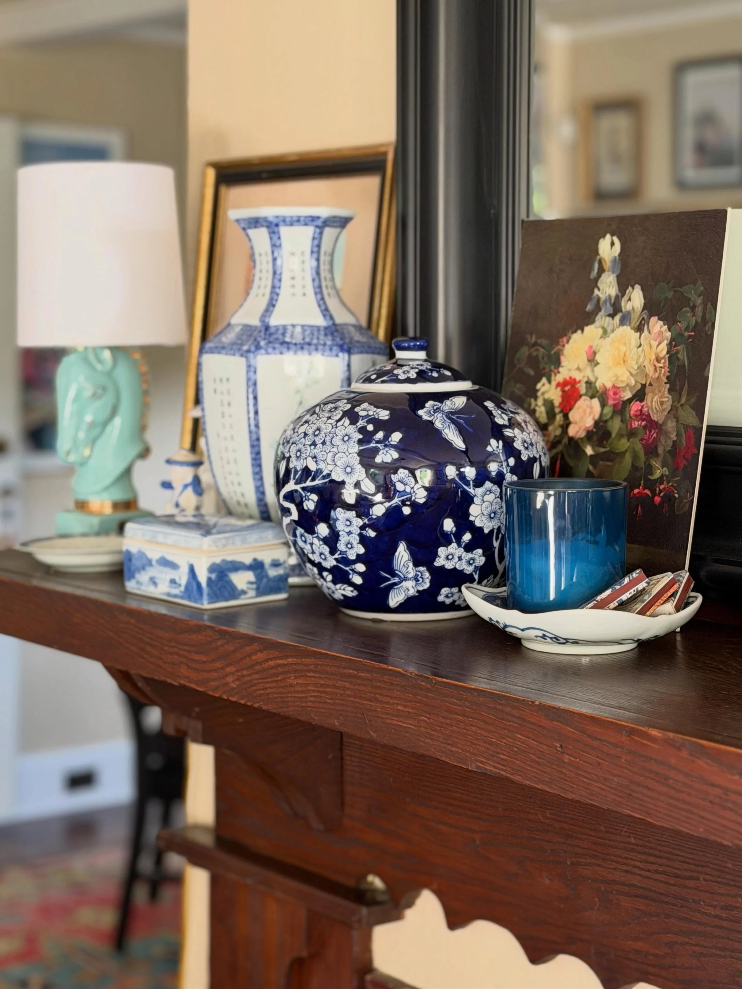
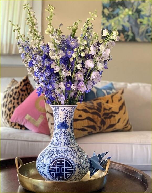
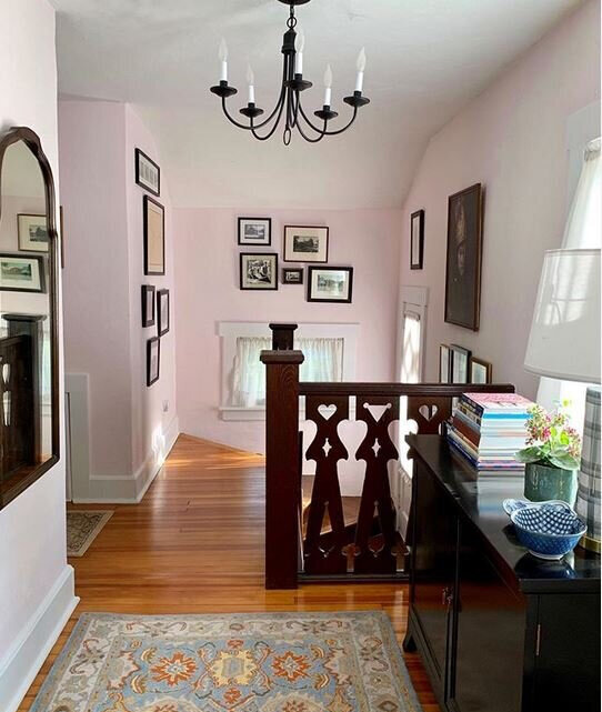
mgk livingroom.png
console table

console table

Let’s start at the beginning… back in July I was lamenting… I didn’t like my livingroom… wah wah…

Should I swap the console table for the cabinet in the upstairs hall? I didn’t like my couch and for that matter I didn’t like the coffee table either… wah!

I stopped dead and decided to pull everything off the console table and restyle - which I did… and viola! Once lightened up with less - I was in love again! Removing frames and books made a huge difference!

2018-08-23+22.30_edited.jpg

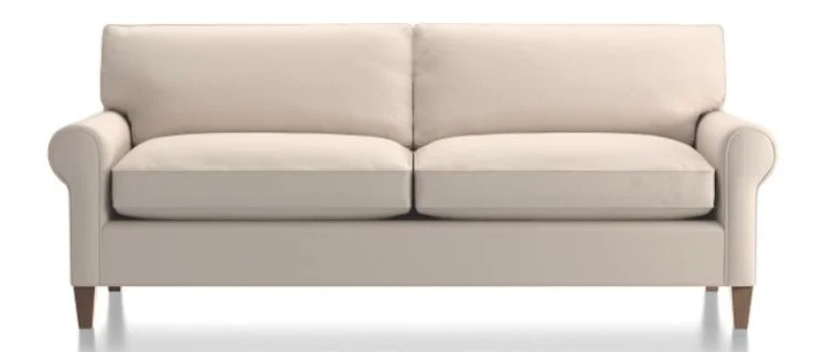
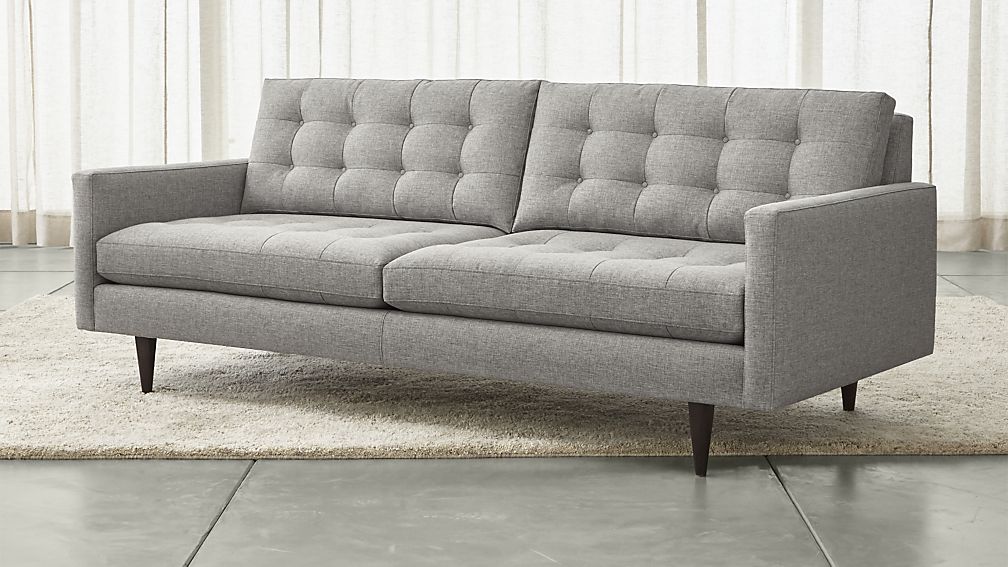
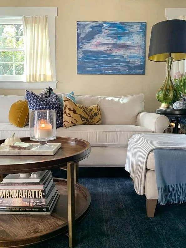
Then I decided I needed to a new couch - if you read my piece from 11/14/2018 Couch - furniture for sitting or reclining. I went to Crate and Barrel and placed an order for the Montclair Sofa - Traxx fabric in Feather - it would be delivered in October. I kept looking around the room going piece by piece… what else could I change?

homesense sharing my image.png

Next up was a coffee table…. while I still love my bench… the rustic finishes were no longer where I wanted the livingroom to be… So I made my way to one of my very favorite retailers Home Sense. In my minds eye I knew what I wanted… and tho and behold it is exactly what I found… round and two tier! I am in love my friends and the brass accents on the legs are the crowning jewel!

top of tv cabinet.JPG

The next bit I tackled was the top of the television cabinet…. I put away a lot of decor.

IMG_3965.jpg
IMG_3683-1.jpg

I love how the top of the China Cabinet is styled. For some reason I had always resisted symmetry - I love my new Home Sense lamps! I was inspired by interior designer and friend Diane Rath - she actually picked up these very same lamps up for a client. Diane is someone I’ve seen use pairs of lamps successfully in her designs. I’m loving the deer art here too - I had never leaned art on a cabinet before… on the floor on the mantel on window sills Yes but never when wall space was available. I grabbed this image prior to moving the Art that was hidden behind the lamp.

I reworked the sideboard as I was de-christmasing the chalet. I wanted to get a lighter brighter look in this area, but, before I went out and shopped for something new - I shopped my house. Moving this cloisonne lamp from the upstairs hall really made the area pop - especially since the lamp shade is white. I also took down a piece of artwork.

IMG_3960.jpg

When we put the Chinese Cabinet back in the corner after Christmas I realized it needed a change too - and that change is this new lamp! I love the pop of white in this corner and yes it’s another Home Sense find! I can’t say it enough whenever I seek I always find it at Home Sense!

Snapseed-1.jpg

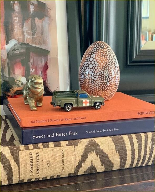
You can see in the above image I also organized the decor on my roll-top desk.

I love the new look of the chalet - it’s definitely more streamlined. This is where I’m headed with my design as we enter 2019. My former funky cacophony of crap decor style was adding to a sense of chaos. In general I am moving away from the look I liked for the last decade… it’s funny how things change and yet they circle back around; 20 years ago I decorated in a traditional vain and then I morphed into a more rustic look and now while I do wish to maintain an air of casual usability I want the Chalet to be pulled together.

Traditional Casual with a touch of Chinoiserie is the new description of the Chalet!

please follow along....PNG

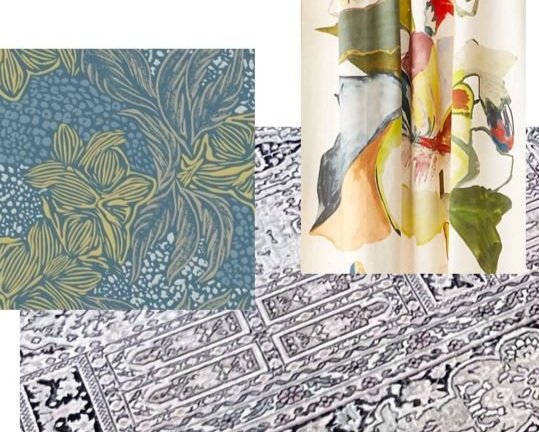
Next week I’ll be sharing the Images that are inspiring my thoughts for new floor coverings!

Til next time!

Gold Heart Meryl.png

Couch - furniture for sitting or reclining

If you follow along on IG and of course you do - haha! than you’ve seen the new additions around the Chalet livingroom. In today’s post - I’m focusing on arguably the largest and most important element in the room. The Couch. I will forever say Couch because I looked up the definition of Sofa, Davenport and Couch and discovered the first two both state they may be convertible into a bed. So Couch it is!

West Elm: Goodwin

West Elm: Goodwin

This is the best image I could find of our now discontinued old couch The Goodwin from West Elm. It served us well for 10+ years and will continue to; now that we’ve moved it into the basement playroom.

You’ll notice a theme - I like simple 2 cushion - clean lines.

Pottery Barn Carlisle

Pottery Barn Carlisle

Because I am a realist - even when it comes to decor I won’t let myself fall in love with something I can’t afford. My list of new couch options was short. While we do have Pottery Barn rugs in our livingroom - and that room is even featured on the Pottery Barn site - I only liked one option from them the Carlisle - but, the very low arms which I thought I loved on-line didn’t work well when I saw it in person.

Onto my go-to retailer for many items in the Chalet over the years - Crate & Barrel and they did not disappoint!

After researching on-line these were my top picks … I know they are all mid-century in feel and I wasn’t sure how that would play out with the other pieces we have but, after taking a single turn around the Mall at Short Hills location my heart and my behind quickly fell in deep love with - the Montclair!

Montclair

Montclair

montclair ottoman.jpeg

We also bought the matching ottoman. Our livingroom is too tight for a sectional - so having an ottoman against the couch offers that functionality and the ability to move it out of the way or to be used as extra seating.

The other important point that made Crate & Barrel rise to the top is how customizable the pieces are. You can choose arms type, leg finish and fabric.

2018-10-29 13.55.14.JPG
fabric close up .jpg

Its a cotton poly blend fabric with a herringbone pattern mix of beige, white, taupe and grey mixed in. I’m in heaven! I’ll write about the rest of the changes in a future post!

please follow along....PNG

Til next time.

Gold Heart Meryl 2.png

a study in scenic walls

This trend while not new in the world of Interior Design has found a fresh vision and I for one am a huge fan of the large scale graphic elements of these patterns. I hope you’ll find these spaces as inspirational as I do. Here’s a bit of history: In the 18th Century hand-blocked wallpaper designs included large panoramic views of Architecture, Landscapes and Pastoral subjects.

This gorgeous space was designed with Rebel Walls paper by Emily Henderson for her daughter. (image @em_Henderson)

This gorgeous space was designed with Rebel Walls paper by Emily Henderson for her daughter. (image @em_Henderson)

This beautiful Master Bedroom belongs to my friend Kimberly Duran she designed it with paper by Rebel Walls. (image @swoonworthyblog )

This beautiful Master Bedroom belongs to my friend Kimberly Duran she designed it with paper by Rebel Walls. (image @swoonworthyblog )

“The room is quite a good size so I really wanted something that made a big impact as soon as you walked in but which didn't overwhelm the space. This mural worked perfectly the black and white design had the wow factor I was looking for without distracting from the other elements in the space.”

Kimberly Duran

This Bath Designed by Etons of Bath Is Breathtakingly Elevated with paper by De Gournay. (Image @etonsofbath) Could you image this as your bath. The grand scale is amazing. The de Gournay paper moves this space from utilitarian to palatial.

This Bath Designed by Etons of Bath Is Breathtakingly Elevated with paper by De Gournay. (Image @etonsofbath) Could you image this as your bath. The grand scale is amazing. The de Gournay paper moves this space from utilitarian to palatial.

High Seas - Rebel Walls (image @Rebelwalls) I wish oh how I wish I had room at the Chalet to accommodate this wall mural!

High Seas - Rebel Walls (image @Rebelwalls) I wish oh how I wish I had room at the Chalet to accommodate this wall mural!

another example of exquisite de gournay wallpaper in this design by Dina Bandman. (Image @dinabandmaninteriors) in the 2017 San Francisco Decorator Showcase.

another example of exquisite de gournay wallpaper in this design by Dina Bandman. (Image @dinabandmaninteriors) in the 2017 San Francisco Decorator Showcase.

how dreamy is this paper - i want to take a walk by this river. (image by @papiersdeparis)

how dreamy is this paper - i want to take a walk by this river. (image by @papiersdeparis)

Another exceptional Rebel Walls paper showcased in this master bedroom by Kristin Laing (image @k.laingdesign)

Another exceptional Rebel Walls paper showcased in this master bedroom by Kristin Laing (image @k.laingdesign)

how adorable is this pattern London houses by Rebel Walls? (Image Rebel Walls)

how adorable is this pattern London houses by Rebel Walls? (Image Rebel Walls)

(Image Rebel Walls) I love the dark background of this pattern. when I was a child my mother had black wallpaper with a floral pattern in our powder room. it was striking. Rita knew for the highest impact to wallpaper the ceiling too!

(Image Rebel Walls) I love the dark background of this pattern. when I was a child my mother had black wallpaper with a floral pattern in our powder room. it was striking. Rita knew for the highest impact to wallpaper the ceiling too!

The two companies that are highlighted in this piece are de Gournay and Rebel Walls. I encourage you to click the links and feast your eyes. This is not a sponsored post I simply love sharing what inspires me here at Chaletmomma.

please follow along....PNG

Til next time.

Gold Heart Meryl 2.png